Branding
Half the battle of building a good business is developing effective branding. Its typically the first thing people see before they see the product(s), you want the branding to convey the product(s) along with a taste of the businesses aura. Branding consists of distinctive designs and unique construction that separate it from other businesses. Sometimes it is easy to forget how influential branding is, though it really can make up a whole brand. For example Nike's famous Swoosh, their swoosh has become associated with the quality and popularity of their products, but the branding is simple enough to be recognized from anywhere. Effective branding such as Nike can really step up a business from its competition.
"Nozzle"
I wanted my brand to convey exactly the type of aesthetic and environment that comes with our business as soon as you see our mascot or logo. An aesthetic that shouts creativity and includes vibrant colors that complement darker colors, while keeping a futuristic and modern feel to the brand. You can see the use of that principle throughout the branding with the frequent use of Bright reddish-pinks and teals along with dark blacks, but still managing to make it look organized through simplistic backgrounds with the isolated branding being the main focus. I love graffiti and always aspired to do my own, although I always was held back by not knowing which spray cans and caps to utilize to get the perfect look. I aimed to fix this by creating my own brand that specializes in spray cans and caps that are made for street art. When you're creating a brand concerning the creation of art, you want your branding to be as creative as the art work you hope to be created with your products.
|
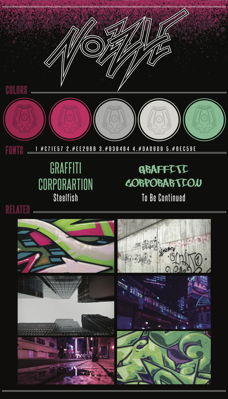
Brand BoardBrand Boards are made to play the role of a template for the brand, not only for customers to understand design choices and principles the brand decides to follow, but to have something the brand itself can refer to so that design stays consistent throughout. To headline the board I decided to use the brand logo, with its double boarded designed that is used frequently with other designs. Below is the 5 color I selected to represent and carry the brand, colors that are soft but still are bright without being too harsh. Next is the fonts you will see used throughout other designs, "Steelfish" is just a traditional font but has a more slim and compact structure, I chose this font because it doesn't contrast too much with the overall modern feel of the brand, its traditional but still is unique enough to not be bland. "To be continued" is a more out there font that speaks for itself, the graffiti-esk font goes with the brands overall theme. And Lastly is the related images. The feel I was aiming for is a city area full of potential and room for graffiti, you will see that in my choice of skyline scenery and images of city like areas.
|
|
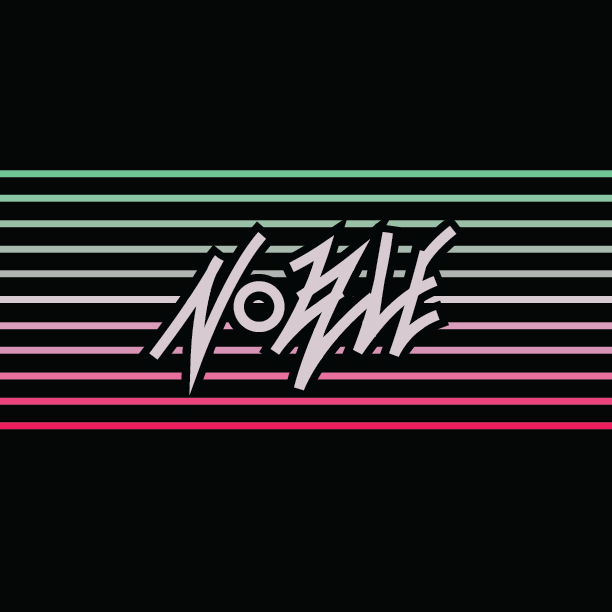
LogoFor my logo, I was shooting for something that screams Graffiti while still being able to incorporate it into simple and minimal designs. The logo looks as if it was ripped right off a spray painted wall, which speaks to our brand. Each letter in "Nozzle" is the same stroke consistency, the letters also connect and make up each other, a design choice inspired by graffiti and street art today. Thankfully the Brand logo can be altered and adjusted in multiple ways to fit whatever design is needed.
|
|
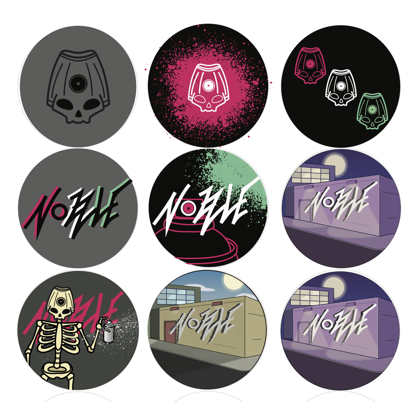
Stickers it When designing the stickers, I didn't want to keep a consistency, I wanted each one to have its own uniqueness and story. Personally I love stickers that are in-direct and are more an art piece then an advertisement, that inspired me to go in that direction with my stickers. Although the Mascot and/or Logo might be seen in each one, they are each incorporated in different ways. For example in the street block design, the "Nozzle" logo is placed as if it were spray painted on a wall. Though Logo isn't intended to be the focal point of the piece, but rather the setting in which the wall is located, a late night with on a street block, consisting of a purplish color pallet throughout.
|
|
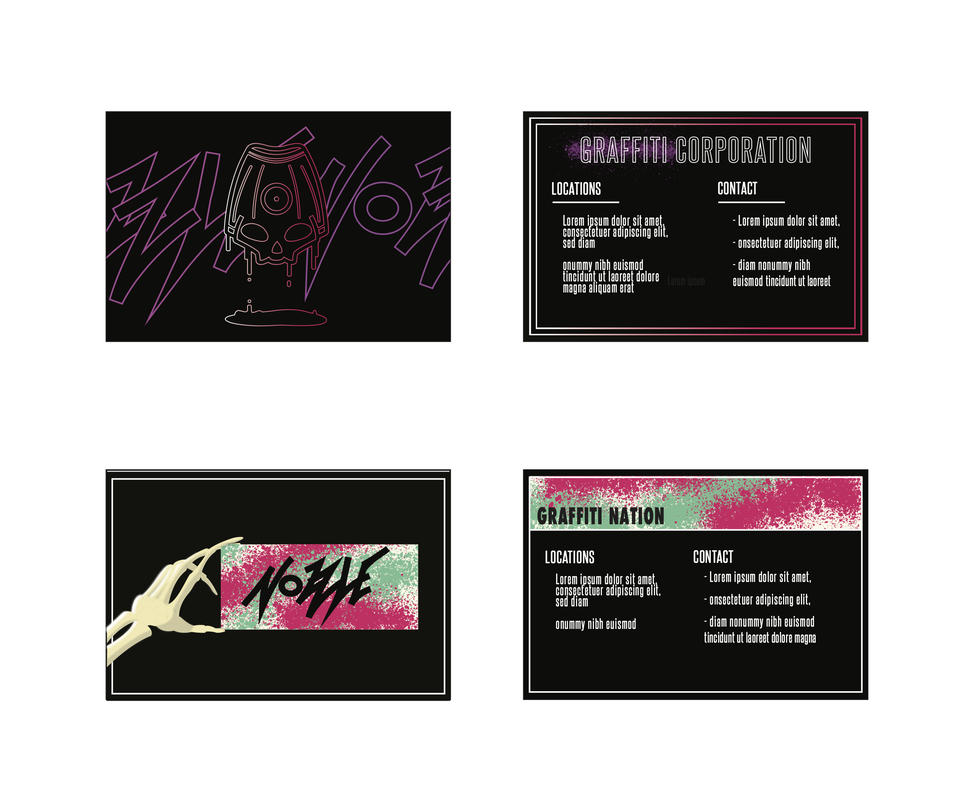
Business CardsAlthough for a brand starting out, its probably better to keep a more consistent and recognizable design, I again wanted to follow the art-piece over advertisement mindset. So again I chose to get creative with the designs, similar to the creativity we hope to inspire with our products. For the top card, I wanted to make it more simple design, I chose the mascot as the focal point, But as you can see each aspect from the foreground to the background is made out clean outlines. The brighter colors set with the black resembles colorful city lights shining through a dark night. With the bottom card, I wanted to be a little more abstract, and go with a skeleton to hold up the brand logo. I chose the skeleton hand because a skeleton is what inspired the design of the mascot.
|
|
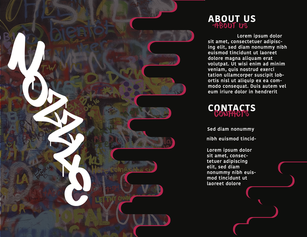
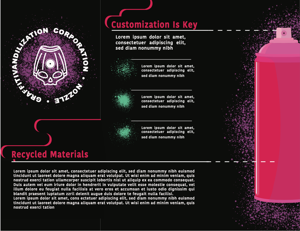
BrochureAt this point you might start to see a pattern within my work, the art choices is more the focus rather than the practicality and information. On the Brochure I still wanted to keep the Street art theme going, so I decided to incorporate a real image of a graffti'd wall and portray as if the logo was there aswell. Also you will see what looks like paint dripping from the right to left, this resembles the paint dripping from traditional street art. As the main focal point on the inside of the brochure, I created a illustration of the product to highlight the uniqueness of our product. The illustration stands out from the rest as it strays from the typical design choices of the brand, as there is no line outline and looks to be as if it some sort of cartoon with the shadow.
|
|
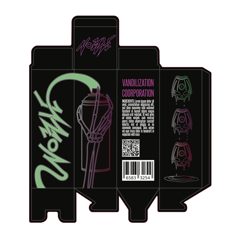
Packaging DesignFor the packaging you can see that I borrowed a design template from a previous business card. I liked the design so much I wanted to use it for something bigger. So similar to the card you will see how nearly everything consists of a double outline, along with a gradient that fades from right to left. The product is on the side being held by another unique design choice, that being the skeleton hand. The can is simultaneously showing its purpose as it connects to another panel and is actively spraying the "Nozzle" logo. I had hopes that doing so might spark interest in the product, as connectivity is not something you usually see in product design. And for the final panel, I still wanted to speak to the creativity, so each mascot is dripping paint into a puddle below them, each different color is represented in the ripples of the paint puddle.
|
|
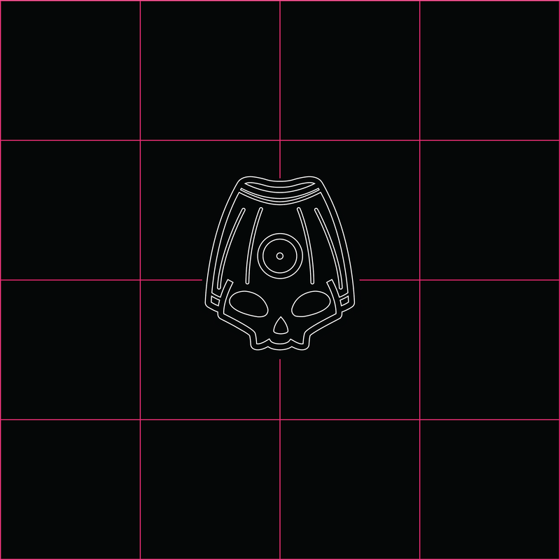
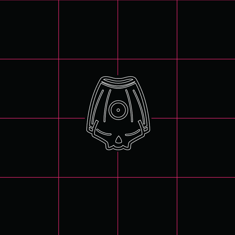
MascotOne of proudest creations in the mascot. It is supposed to resemble a cap of a spray can bottle, you can see this with the spray whole indention and the lines coming down the cap, something you often see on spray caps. Through to again to be creative I decided to personify the cap and give it a face, though one that is in between intimidating and friendly. The mascot is a soft skull face fused with the spray cap. With its unique minimal shape, hope is that even from far away or when is shrunken in scale it will still be recognizable.
|
|
Animated GifAnd for our final project, we took the challenge of making animated gifs. I had many ideas for what I wanted to create with this opportunity, but restricted with my skill level, I wanted to stay on the simpler side. The Mascot starts off as it is sleeping or resting, then wakes up to show it is a living thing. Before spraying the screen, the mascot shows some of its personality with its slow blink, followed by a wink, as if it is spraying the screen/user as a joke. The paint then drips off, similar to that of clumped graffiti spray. Though its made evident that the paint also managed to get on the mascot, as small amounts of paint drip of its head along with the paint on the screen.
|
